Showing posts with label user-experience. Show all posts

Tuesday, September 11, 2012

Improving User Experience: The Audit Trail

In August, we finished initial work on a new OpenELIS feature: the Viewable Audit Trail. Jan wrote about the Audit Trail, explaining the impetus and the first phase of development. In short, it came out of discussions with our colleagues in Cote d'Ivoire about ways to better troubleshoot problems, both with samples and the OpenELIS system itself.

As part of an on-going process to improve the OpenELIS user experience, I've been thinking about how to best implement some features that will make the system easier to use and give users faster, more intuitive ways to get their work done. So as part of rolling out the Audit Trail, I took the opportunity to use it as a test case for some new features.

A picture can say a thousand words, so here's a quick comparison of the "old" and "new" versions:

Old Audit Trail

New Audit Trail
We've done a few things here:

  • Added summary information at the top: the order/accession number, the date it was created and the current status.
  • Just below that is a new row with tools for sorting through the audit trail. It shows the number of "entries" in the database and allows for filtering through the entries by searching of by selecting a category. Very useful for an order that may have hundreds of rows in the database.
  • The table itself has a new, more modern look and can be sorted. 
If a picture is worth a thousand words, surely a video is worth even more. Here's a short screencast that shows these improvements in action.


We know OpenELIS users have a lot to do. All the user experience (UX) improvements are intended to the user's goal (in this case, understanding where a problem may have occurred) easier, faster and, dare we say, more pleasurable experience. We hope that being able to parse through tables more quickly and getting better feedback from the system will lead to significant saving in time spent per order and a reduction in the error rates.

We're making all this happen by employing some new and powerful software frameworks. The new Audit Trail UI relies on:
  • jQuery - an open-source Javascript library that has all sorts of tools for "client-side scripting". That simply means being able to do things on screen after the page is loaded. For example, changing the sorting order of a table.
  • DataTables - an open-source jQuery plug-in that handles the interactions to the HTML table.
  • Bootstrap - an open-source CSS framework from the good folks at Twitter. It's a flexible and efficient way to build UI elements in web apps that work across all major browsers.
The updated Audit Trail will be part of the next set of OpenELIS releases. And the UI will soon be applied to other sections of OpenELIS.

As always, please let us know if you have any thoughts or questions.

- Mark


Wednesday, August 15, 2012

Improving Error Messages to the User

Jan talked about the work we've been doing to better isolate the causes of the "Grey Screen of Death" — the error page that appears when there's a problem with the OpenELIS system. She mentioned the frustration with the vague "it's not your fault" language that appeared on the GSOD page.

Old "GSOD" error page in French:


Old "GSOD" error page in English:


The original intent was to assure users, particularly those without a lot of experience with such systems, that they didn't "cause" this problem hence the "it's not your fault" language.

While that sounds good in theory, we learned that what's most important is to figure out what went wrong and get it fixed. By providing more context when someone sees a "GSOD" error, we can get better feedback on what happened. This can make the process of auditing what went wrong much easier for the on-site system administrator and, ultimately, the development team.

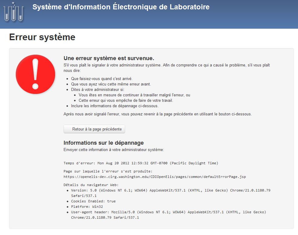
To that end, we've redesigned the "GSOD" page to grab details about the user's browser, path through the system, etc. We also tried to include clear action steps that are general enough to make sense at any lab that uses OpenELIS. We also made it a little more appealing to the eyes:


First off, you'll see that the error message now keeps the OpenELIS "header"—that section at the top of the page with the logo and the blue background. Compared to the old version that just had the gray error box on a blank page, this version may be a little less jarring to the user.

The top section lists steps that the user should take to help report this problem. At the bottom is system information that can easily be copy and pasted into an email or printed. Not shown in this screenshot is the listing for the previous page the user was on before they saw this error—this can be particularly helpful in understanding what happened.

This is a start, but we're doing more work to make the (hopefully infrequent) encounter with system errors more efficient. We'll be adding a separate 404 "Page not found" error message that will have specific reporting instructions. We're also thinking of what, if any, part of the server error log could be included. While that might be helpful, security and privacy remain paramount - we don't want to expose any details that could be used to attack the system if an unauthorized user gained access.

If you have any questions or comments, let us know. And if you think of a better name for this new friendlier, more helpful page than "Grey Screen of Death," we'd be happy to using a term that's a little less morbid.